Web design. Magazine (newspaper) style
In our dynamic information age, newspapers and magazines are all around us. Bright covers and shocking headlines on them encourage us to definitely buy a magazine or two, which then “settles” forever in the bowels of the apartment. Attempts to get rid of newspapers and magazines are unlikely to be successful - you will not have time to throw out the old ones, new ones will immediately slip into your mailbox, and so on, ad infinitum. In addition, many people collect magazines, however, over time, the collection grows so much that it leaves no room for its owner. We have found a way out of the vicious circle of paper: for this, you just need to correctly combine newspapers and your interior.
The first thing that comes to mind is the use of old newspapers as wallpaper. Many, having read this, will curl their lips, remembering how apartments pasted over with newspapers look during repairs. However, we do not call for sticking newspapers everywhere and everywhere, a much more aesthetic solution would be to highlight some kind of “newspaper” zone, which can be additionally decorated with elements that are suitable in style.


If you don’t like this option at all and your soul actively protests against newspaper headlines, you can limit yourself to collages from magazines or newspapers, as well as impromptu “pictures”.


Such solutions are suitable for almost any style and add a touch of popular postmodernism to the interior.
2. Decorative elements

It may seem that in terms of decor with newspapers, you won’t really “turn around”, however, this is absolutely not the case. Due to their monochrome, they are successfully combined with many details, so you can create almost anything from them. It can be all kinds of boxes, caskets, garlands and table decorations. A romantic theme will look very interesting, especially if you use political publications. Newspapers can be used both as part of the decoration and as the main element - it all depends on the density of the material, and, of course, on the dexterity of your hands.


As for magazines, they are more suitable for finishing something. An excellent solution would be to frame the mirror with the help of "tubes" of multi-colored magazines: here you will immediately kill two birds with one stone - create an interesting design and use the lion's share of your waste paper.


In addition, in the resulting "windows" you can store various little things or hide savings for a rainy day.
3. Functional interior details

The functional use of magazines in the interior is just the case when the phrase "coffee table" takes on a double meaning. Yes, yes, your bedside table can now consist entirely of magazines, for this you just need to fold them in an impressive pile and fasten them at the top and bottom.

This option will be most appropriate for those who absolutely do not want to part with their collection of magazines and will often “pull out” part of the table to read at night. If magazines do not represent such value for you, then improvised furniture from them can be much more diverse. You can create a table with chairs, and even a sofa: for this it will be more practical to use some kind of base - after all, you cannot predict the complexion of your future guests. However, it is possible to use only magazines, however, in this case it is better to fix them “tightly”.


Whichever option you choose, it will undoubtedly add dynamism to your interior, because now you will literally have ideas and smart thoughts in the air.
Photo: likeforyou.ru, tridevici.com, interiers-foto.ru, vk.com, abcgreatpix.com, designea.ru, magicaldecor.ru, blockstroi.ru, lady-ladik.livejournal.com, subscribe.ru, cityspb. ru, mirtesen.ru, styldoma.ru
The fashion for retro and vintage style is gradually entering the design of websites from the catwalks of fashion shows, especially in the west. Some design studios even specialize in the development of websites in retro and vintage style.
The retro style includes a style that is more characteristic of 1910-1940, the vintage style is much closer - this is already the style of 1950-1980. (style of the hippie and disco eras).
We still prefer standard, popular styles in web design. A client, ordering a web design, asks to do it like those over there. And as a result, the same type of sites are obtained, and then you don’t remember whether you have already visited this site or not.
Website design in vintage or retro style, of course, is not suitable for every business, not everyone can and should not like it, but, no doubt, they are stylish, original, spectacular, individual and memorable. When creating a web design, it is not necessary to use all the elements of a particular style, sometimes it is enough to introduce some basic components.
Popular items used in retro and vintage website designs:
- rare car models
- goods,
- package,
- stamps,
- photographs of popular people of that era,
- popular posters, paintings of the last century.
The effect is enhanced by a selection of fonts typical for those years, background colors, graphic elements, images and photographs.
An important part of website design in retro or vintage style is the use of texture: vintage tome, torn paper, ink texture, old letterpress paper. All of them together allow you to achieve the desired effect, achieve a more accurate transmission, recreate the style and design of that time.
We offer a selection of sites in vintage and retro styles. In addition to design or individual elements, the structure of sites, original selling content (even with Google translation) are interesting. Perhaps even these sites will prompt you to create new, interesting projects on the Internet. Why not?
See for yourself:
http://www.thrushexhaust.com/ Elegant design of the site in vintage style, all components are sustained.
http://www.cottonseedoiltour.com/
The site of the national American trade association of manufacturers of natural cottonseed oil, which is popular in the United States. The site design in vintage style enhances the effect of "oil with history".

http://prospectdenim.com/
The site of the brand-manufacturer of jeanswear. Judging by the design of the site, this is a brand of jeans with history. An American farm in the 60s and 70s, birds sing, a windmill roars, an old farm truck pulls up...

http://www.torpedojuice.co.uk/
Website for a web design and marketing studio.

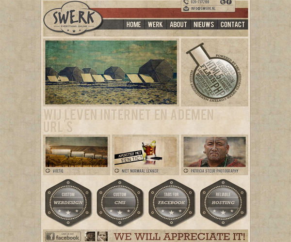
http://www.swerk.nl/ Website of a Dutch web design studio
http://www.portlandbrewing.com/ Brewery website

http://tnvacation.com/ German site of professional online fortune tellers using TARO cards and other methods.

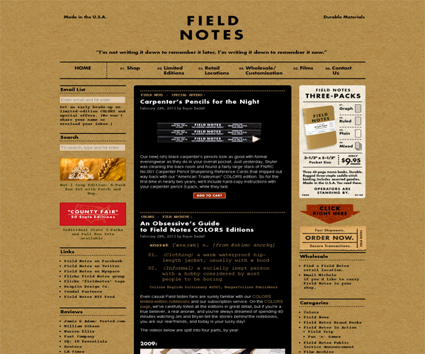
http://fieldnotesbrand.com/ Site of producers of original notebooks for notes. Effective selling text, original design, presentation of goods - take a look, it will be interesting to learn.
http://singularityconcepts.com/

http://www.thisistommy.com/ Creative agency website

http://www.bluemoonduelingpianobar.com/ Restaurant and piano bar website

http://www.teamfannypack.com/ This is a fan site for a modern football team, only done in a retro style. Thanks to the original, individual design of the site, fans will distinguish it from thousands of other sports sites.

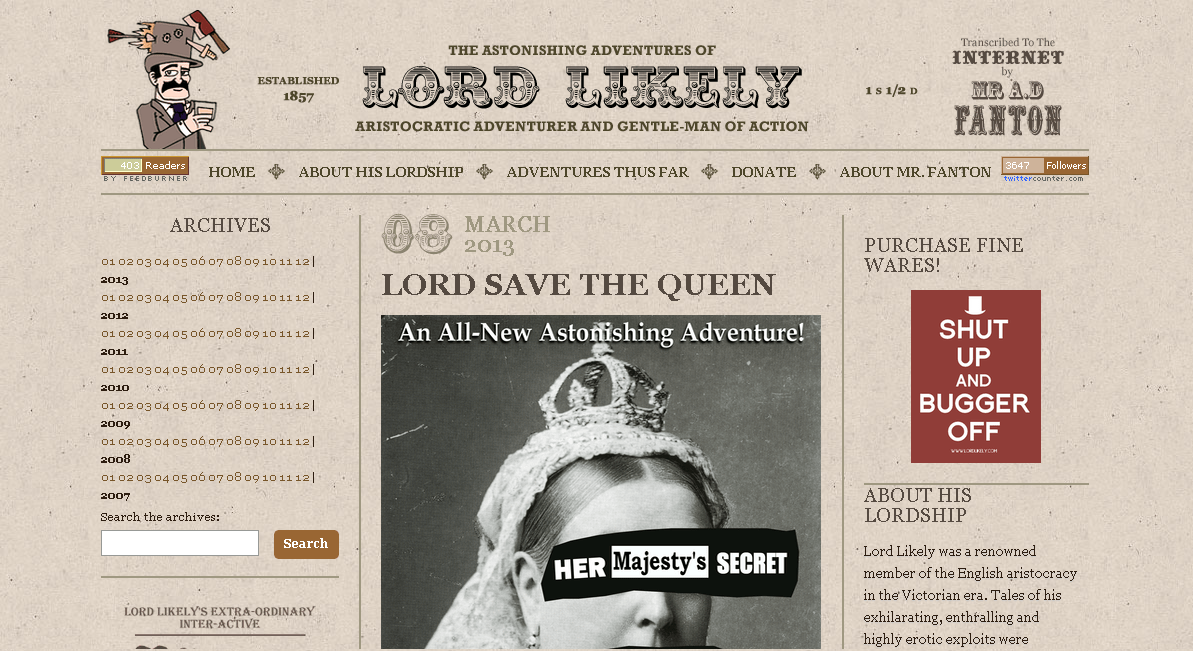
http://www.lordlikely.com/ Not only the design of the site in retro style is interesting here, but also the content of the site: images, articles.
http://www.whatisyourproblem.co.uk/ Already by the name of the domain, it is clear what the site does - it helps to solve problems, psychological assistance.

http://www.enochs.co.uk/ The original site, thanks to the design and use of modern technologies. Although he has practically nothing to do with the styles in question, it was a pity to throw him out of the selection. The design of the site is reminiscent of a revived Hemingway story. Check out the site, take a dip in the sea.
http://www.level2d.com/ Web design studio website

http://www.reklama-audio.pl/ Polish advertising agency website

http://www.web-o-matic.co.nz/ Web design studio website

http://adaptd.com/ Another website of a web design and promotion studio

http://ericsempire.com/
And other sites:
http://www.jeffsarmiento.com/

http://ithacabakery.com/

http://www.sensisoft.com/

http://19-27.co.uk/

http://sprockethouse.com/

http://daleingram.com/
Newspapers are issued in several formats: A4, A3, A2.
The largest format - A2 (420 x 594 mm) - is used for central city and regional newspapers. Usually in such publications there are 6-8 columns.
A3 (297 x 420 mm) is the main newspaper format, most of the news publications are published in it (Metro, Vecherny Petersburg, Vesti). The strips contain 3-5 columns.
A4 format (210 x 297 mm) is great for corporate, student and entertainment publications. The number of columns is 2-3.
The width of the columns is in direct proportion to the format of the strip - the printed area on the page.
The main text in newspaper layout is typed in easy-to-read fonts (for example, Times New Roman), the font size is 8-9 pt. Recommendations regarding newspaper layout fonts are set out in OST 29.125-95 - Newspapers. General technical requirements. The narrower the column, the smaller the font size should be used.
Headings are usually typed in various fonts, 12-36 pt in size. They are arranged in the format of one or more columns, the words are transferred according to the meaning (for example, it is unacceptable to transfer it like this: “Moody’s has taken // rating actions against 10 Russian banks”).
Newspaper layout: basic concepts
- Center - the distance between the columns.
- A ruler is a dash of any thickness that separates materials.
Newspaper strip elements:
- The heading part is the name of the publication, issue number, name of the organization, calendar information, slogan, appeal.
- The subtitle is the editorial.
- Attic - material placed at the top of the page, exceeds more than half of the page (2/3) in width, a third or a quarter in height.
- Footer - material at the bottom of the page.
- Window - text or graphic material, laid out in the form of a rectangle in the upper right corner. The window is separated by rulers at the top and side.
- Lantern - material placed in the center or at the bottom of the strip for 2-3 columns, and the height of the lantern is greater than the width. Separated by lines.
- Riser - text that occupies the entire height of the strip, occupies 2–3 columns.
- Corner - material placed in any of the corners of the page, except for the top right corner.
- Underlay - text or illustration that takes up free space under the article to maintain the height of the columns.
- Headers and footers are a mandatory element that is present on every page except the first one. It is wrapped either to the width of all columns, or in the lower corner, to the format of one column. The footer contains the output data of the newspaper: title, number, date.

General rules for newspaper layout
speakers
- The entire newspaper must have the same number of columns on each page. It is possible to reduce their number for one publication per page.
- Lines of text in adjacent columns should be strictly opposite each other.
- An important requirement is the same number of lines in the columns, the last lines are aligned in one straight line.
- The centerpiece should take at least 12 pt. moreover, rulers or other decorations can be placed in this space. Their distance from the text is at least 6 pt.
- The distance from the headers and footers to the text is approximately equal to the middle.
Titles
- The larger the article, the larger the headline. The same goes for the significance of the note.
- Headings can be placed on the width of all columns (header), several columns or one column. It is not recommended to place two headings at the same level (in adjacent columns).
- Footnotes are placed in the column where they are referenced. A footnote to the general heading is placed in the first column.
- Long headings consisting of two lines are typed in a small font size, one step less than small headings.
- Thematic subheadings are typed in a font that is 2 steps smaller than the title itself. Internal subtitles of articles - 10-12 pt.
Illustrations
- The size of the selected illustrations should be a multiple of the H-th number of columns.
- It should not be forgotten that due to the poor quality of newsprint, small details in illustrations (especially small ones) may be distorted.
- Figure captions are typed in a font, the size of which is at least 8 points. The space between the illustration and the caption is at least 10 points.
- Tables and illustrations should preferably be placed between paragraphs.
Successful use of magazine style can be for portfolio sites with the work of artists, photographers, designers etc. Also, magazine style can often be found on the pages of online trading sites - online stores.
Thus, the magazine style in web design finds the widest application and can be used for a wide variety of sites. However, in this case, as with any other style of web design, the convenience of the site () for visitors comes first.
It is important that visitors feel comfortable on the site so that they can get all the information they need. Without this, even the most fashionable and beautiful magazine design remains only a "bright wrapper", "dummy".
Entrusting the development of a magazine-style website to professionals is the only sure way to avoid problems with website usability and inefficiency. Only professionals can, using their knowledge and accumulated practical experience, identify the "strong" and "weak" aspects of using magazine web design for each specific site. An individual approach to choosing a web design style for a site is the key to creating the most effective web resource that meets your goals and objectives.
Web design studio WebStudio2U offers services for the development of web design of different styles and trends.
from WebStudio2U right now and get high quality results at a reasonable price!


